Gated Toggle
Background
The TryNow Gated Toggle gives shoppers the ability to opt in or out of Try Before You Buy. The display state of the toggle will be automatically recalculated on each page load.

Implementation
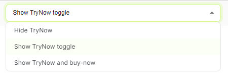
You can select the toggle experience for your TryNow products in the Button Visibility Rules of your Merchant Portal under the Controls tab. While creating a rule, it will show up as 'Show TryNow toggle'.

What's next?
TryNow recommends testing your gated toggle out-of-the-box before implementing any modifications, and recommends familiarity with Shopify Liquid Theme code.
The Toggle
The toggle is positioned directly below the <trynow-cta-button> and is integrated with the TryNow CTA button. It cannot be moved.
Heads up!The toggle is integrated with the TryNow CTA button such that is plays a part in calculating CTA visibility. The toggle will only be hidden when a product is ineligible for Try Before You Buy purchase options.
Toggle Positioning
Because the toggle is placed directly below the TryNow CTA, styling can behave differently in different themes. To manage styling, we recommend selecting the toggle directly and editing styles there.
The custom gated flow toggle element can be selected.
document.querySelector('gated-flow-toggle')Styling
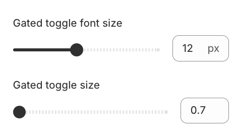
TryNow provides two settings for the Gated Toggle, font size and switch size. These settings are found as part of the TryNow CTA button.

Heads up!Under the hood, the Gated Toggle is a checkbox. If you're experiencing issues with the toogle, first ensure that there aren't any global CSS classes that might be affecting the behaviour of checkboxes in your theme.
For more specific changes, the below selectors are available and CSS can be added to the TryNow CTA Button Custom CSS setting block.
| Selector | Description |
|---|---|
gated-flow-toggle | Represents the container for the Gated Toggle. |
.tn-gate-toggle-switch | Represents the switch for the Toggle. |
.tn-gate-toggle-tagline | Represents the text adjacent to the Toggle. |
Updated 6 months ago