
Button Entry Point
Follow the solutions below to implement the TryNow Entry Point and find resources for common caveats
Background
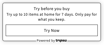
The Entry Point serves as an initial interaction and opt-in point for customers interested in the Try Before You Buy (TBYB) experience.
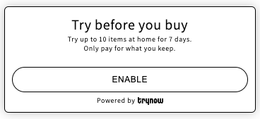
The entry point is integrated in product detail pages (PDPs). The entry point can only be added on a Product page.
What's next?
TryNow recommends testing your entry point out-of-the-box before following the below steps. You should also have some familiarity with Shopify Liquid Theme code.
The Entry point
The visibility of the Entry Point is directly tied to the presence of the TryNow CTA button on the Product Detail Page. If the TryNow CTA is absent from the PDP, the Entry Point will not be displayed even if the app block is included in the template.
For more detailed information about implementing or troubleshooting the TryNow CTA button, please refer to the CTA Button documentation.
1. Styling the Entry point
The Entry Point offers a variety of settings to modify the text and style of its components. However, for more specific styling needs, you can utilize the Custom CSS setting within the theme.
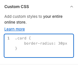
HintFor this setting, you can utilize any selector to customize the Entry Point. However, it's important to note the in certain situations, you may need to use !important to override existing styles effectively.
2. Selectors
| Selector | Description |
|---|---|
product-entrypoint | Represents a container for product entry point content. |
#pdp-entrypoint-banner | Represents the banner area of product entry point. |
#pdp-entrypoint-top-section | Represents the top section of the product entry point, which includes the title and the text. |
#pdp-entrypoint-title | Represents the title within the product entry point. |
#pdp-entrypoint-text | Provides additional text under the title, supporting the main message with more details. |
#pdp-entrypoint-bottom-section | Represents the bottom section of the product entry point, which includes the button and the Powered by text. |
#pdp-entrypoint-button | Defines the button within the product entry point, facilitating user interaction such as clicking. |
#pdp-entrypoint-powered-by-container | Container for branding or additional information, often located at the bottom of the entry point. |
#pdp-entrypoint-powered-by-text | Text component within the powered container, used for displaying small print or auxiliary information. |
#pdp-entrypoint-logo | Displays a logo image, enhancing brand recognition or visual appeal. |
#tn-cta-info-icon | Represents the information / learn more icon below the CTA button. |
3. Additional classes
You can apply custom classes to the Entry Point button using the Additional Classes Setting. This allows for further customization to match your site's styling.
If you wish to replicate the style of the "Add to Cart" button, you can refer to the following setting.
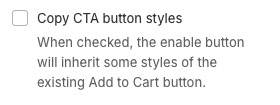
If that does not successfully copy styles, you can add them manually:
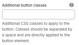
HintWe recommend using the same classes that are applied to your Add To Cart button to ensure consistency in the design.
4. Positioning the Entry point
The Entry Point can be positioned anywhere within the Product Detail Page (PDP).
TryNow recommends positioning the entry point below the Add to Cart buttons. If this does not happen automatically, we provide an auto-position setting.
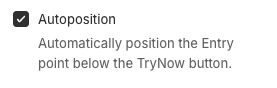
You can also place the Entry Point directly below any component identified by a specific selector.
5. Different theme
Sometimes it will be necessary to apply a different style to the Entry Point to make it look better with your site.
If that's the case, then you can copy/paste the following code into the CustomCSS setting of the Entry Point
#pdp-entrypoint-bottom-section {
	max-height: 48px;
}

#pdp-entrypoint-powered-by-container {
  position: relative;
  top: [CUSTOM_VALUE];
  margin-top: unset;
}
Heads up!Remember to replace the
[CUSTOM_VALUE]placeholder with a value according to your needs.
Updated 5 months ago